
Hello, I'm Fahad Rauf
Tableau Specialist & Full-Stack Developer
Bridging the gap between data insights and functional engineering through elegant dashboards and real-time web applications.
Tableau Specialist & Full-Stack Developer
Bridging the gap between data insights and functional engineering through elegant dashboards and real-time web applications.
With a Bachelor's degree in Computer Science, my journey in tech quickly led me to a passion for creating data visualizations. I thrive on transforming raw data into insightful visuals using Tableau.
My visualizations are inspired by the beauty and colors of the world and things around me. My affinity for aesthetics is mirrored in my projects embodying my love for elegant, eye-catching design. As I merge the worlds of data and frontend development, I am excited to continue refining and expanding my skills.
.png)
Designed an interactive Tableau dashboard analyzing how various lifestyle and academic habits affect student exam performance. Explored correlations between study time, parental education, gender, job status, internet quality, and exam scores.
.png)
Designed an interactive Tableau dashboard using the IMDb Top 1000 dataset to explore trends in movies, genres, and directors. Visualized key metrics including top-grossing films, most frequent directors, and dominant genres over the decades.
.png)
Developed a Tableau dashboard to visualize the global impact of the COVID-19 pandemic using time-series case data. Analyzed trends in confirmed cases, death rates, and country-wise impact to uncover key patterns.
.png)
Built a Tableau dashboard to analyze customer churn patterns for a telecommunications company. Used demographic segmentation to identify high-risk customer groups and trends in churn behavior.
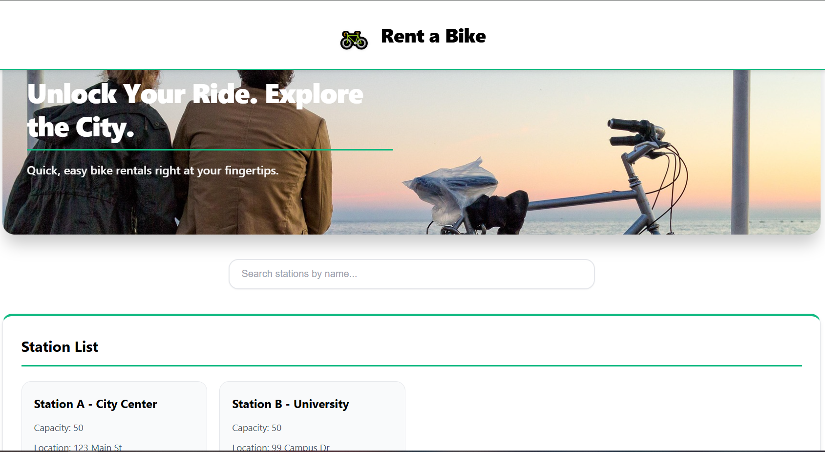
Developed a MERN stack application to manage bike-sharing operations and real-time inventory. Engineered a RESTful API to automate booking and station updates in MongoDB, synchronizing live availability across the React UI for a seamless user experience.
If you're interested in working together or have any questions, feel free to reach out. I'm currently open to freelance opportunities in data visualization and dashboard design.